How to add a slide to the 'Hero Slider Advanced' widget
The hero slider advanced widget is a multi faceted widget, allow you to create a 'simple' slider, where it is only images, great for visual slideshows OR have it be more informative, promotional type items.
In this overview, we will go over creating a more 'Advanced' slider, one that will utilize not only the slider but the other options such as HTML areas and featured elements.
Step 1 - Add widget to the page
To get started, we will first add the "Hero Slider Advanced" widget to the page. This can be done by selecting the add widget button on any page
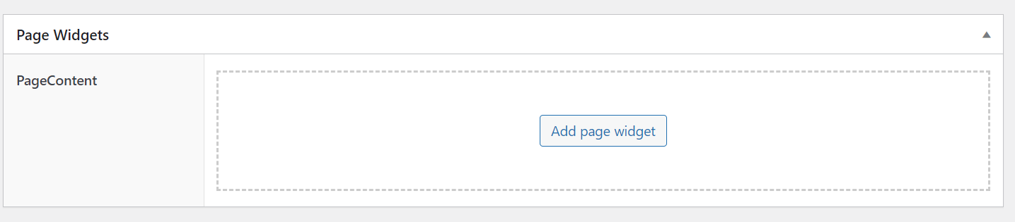
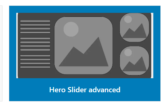
After clicking on the add page widget, select the 'Hero Slider Advanced' box
Step 2 - Configure the slider
Once the widget it on the page, you will have multiple tabs to configure, letting you control how the slider looks and operates.
- Slider Settings
- Slides
- Featured Area
- Option Area
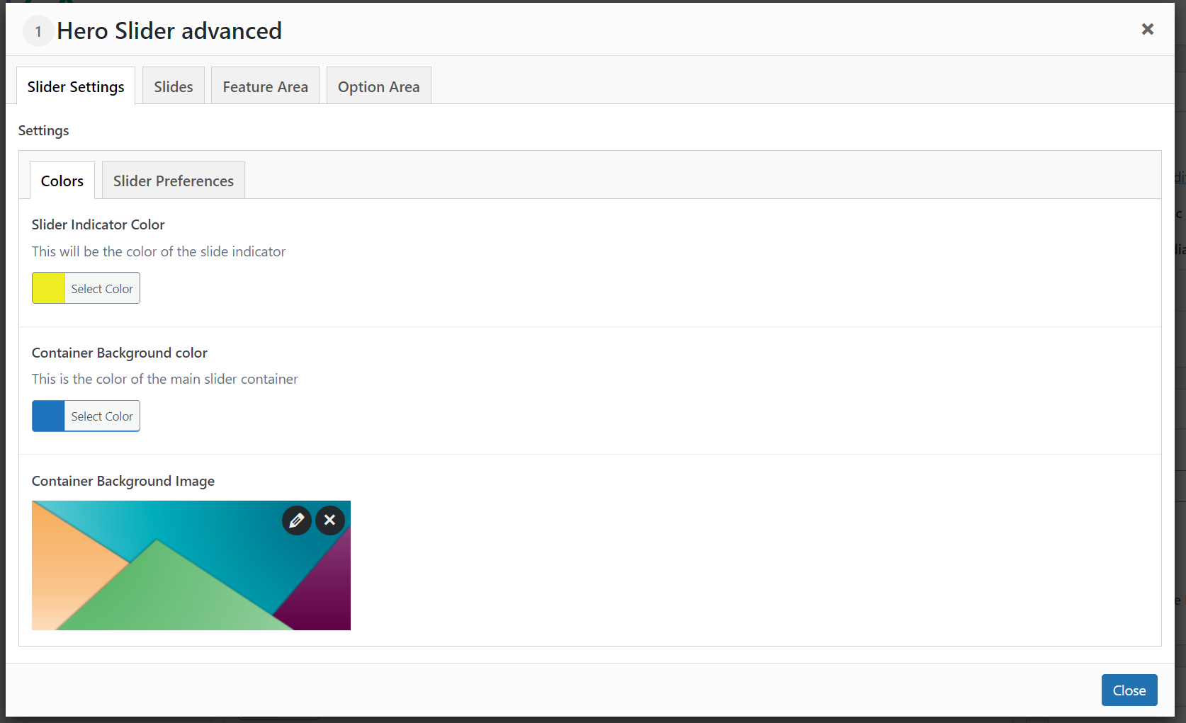
To get started, we will first configure the slider settings. These settings control the overall slider colors and settings allowing us to control things like
- Indicator color
- Transition Speed
- Auto Play
- Effect
And much more. For a full list of settings, please refer to the widget docs.
For the settings we are going to set the settings to be
- Indicator color to Yellow
- background color to Blue
- Set a background Image
The settings will look similar to this
Slider Preferences
Now that we have the color and background image set, we will select the slider preferences tab, this will display a longer list of settings, allowing us to fine-tune the slider
For a full list of settings, please refer to the widget docs
We will set the slider settings to be
- A slide transition
- 5 seconds for each transition
- 1 slide per view
- with arrow or pagination indicators
- 450px container height

Step 3 Adding slides
Now that we have our initial settings, we will set a few slides for our slider.
Slides should always contain a text overlay, unless they are purely visuals and not informational. All images must contain description alt, title, caption, and descriptive text. This text is used throughout the site and will allow visually impaired users the ability to understand the image being presented.
Images should accompany the text but must not be the text or main subject of the slide. A slide must stand on it own regardless of the image.
We will first click the add new slide button. This will bring up a number of options, allowing us to configure the slide

To add more slides, click the add new slide button again
Each slide can be dragged and dropped to change the oder, changing the order will change the position a slide is in the carousel
To start, we will
- Select a background image ( this can be new or existing )
- Set the background color ( Mobile use )
- Set the display type (cover)
- Don't repeat the background image
- Don't show the background image on mobile
Because of the nature of the slider, there is no set image size. This is due to the fact that a slider can contain multiple slides per-view OR may or may-not have and option area etc. This means there are countless image sizes. It is important to find the image size that works well for your needs.
After, our settings should look like this

If we take a closer look at the image we have selected, we will notice a few things

- It's not descriptive
- The visual elements add to but are not the main element
- There is a portion of the image that is left blank for a text overlay.
Because we will be using the text overlay on this, the image will lend itself to the text, but again, is not the main focus of the slide
Text settings
Now that we have our slide, we will set the main header text, subtext, and button text, along with high contrast button colors. For this example we will use

Each text section has a class option. The class option allows you to add a class to the element, this can be a margin or spacing class (See the CSS section of the documentation) or your own custom class.
We will not set the text alignment, this will allow us to set how the text will display. Because the image we have selected has a blue area to the left, we will set
- Left aligned text
- Large text area size 50%
- Medium text area size 80%
- Small text area size 100%
The text area size allows us to set the content area, depending on the break-point. The large being the full width, medium being a medium screen and small being mobile
Before moving forward, lets take a look at what our slider looks like. We have not added the featured image or option area yet, so we expect the image to cover the full screen.

One thing you will notice is that the text seems to 'break' to a new line. This is the default behavior, but this can be changed by setting the word break option in the settings, lets change that and see how it looks.
This setting is in the 'text area > word break '

Once we change that, we can preview how it will look again

Great, that looks better, now we will move on to the featured Area.
Featured Area
The featured area allows us to add additional images and or sliders to the slide. This means the slider can promote multiple items, all using the same slider widget.
For this tutorial, we will be using static images, however, you can set the featured images to be sliders as well.
To start, we will first select the location of the featured area, for this overview, we will select 'left' and we will add 'two' rows
The Featured area can have a maximum of 2 (two) rows
Next, we will
- Select an image
- Set the heading text
- Define the text container width ( in percentages )
- Set button text, color and hover colors
- Set the URL (if any)

We will give this a preview now to see what it looks like.

We can see that some of the text is not exactly how we would like it so we will make a few adjustments to the container width and text size.

Now when we preview it, we can see it display a bit more to our liking.

You will want to play around with these settings, each page will have different requirements so you will want to choose what is right for that page. You will want to test out font size and container widths to see what combination works best for each page.
Step4 Option Area
The last part is to add the option area. The option area is a special area that allows you to add HTML OR set a link list. Because it has an html option, you can put in things like iFrames or other HTML, if you need a list of links you can build one out here.
Fot this, we will do a simple HTML element, where we add some placeholder text.
First, we will set the position
- Right
Next we will check the HTML box

The HTML box area is a more advanced option, it is recommended that you always set the structure to the bootstrap row.
<div class="col-2">[your content]</div> this will ensure it is placed on the same row
We will then add a bit of HTML and preview the slider


That doesn't look correct, the html seems to be on the line below? This is because we did not give it any formatting or container parameters. (see tip above)
Because we want this to be on the same line, we will add the bootstrap row markup
<div class="col-lg-2 col-12 col-md-12 col-lg-2 col-xl-2 "><div style="background-color:white;border-radius:5px">[your content]</div></div>

Ok, that's a bit better, but we want this to have rounded corners and a white background to better match the site.
This can be done a few ways
- Add inline CSS to the HTML elements
<div class="col-lg-2 col-12 col-md-12 col-lg-2 col-xl-2 "><div style="style="background-color:white;border-radius:5px">[content]</div> - Adding a class to the div
For this, we will keep it simple and just add an inline style
Now we can see the white background and rounded corners.

🎉 Congratulations!
You created your first slider!